Correio da Manhã
Vasco Ferreira — Media Branding & Design
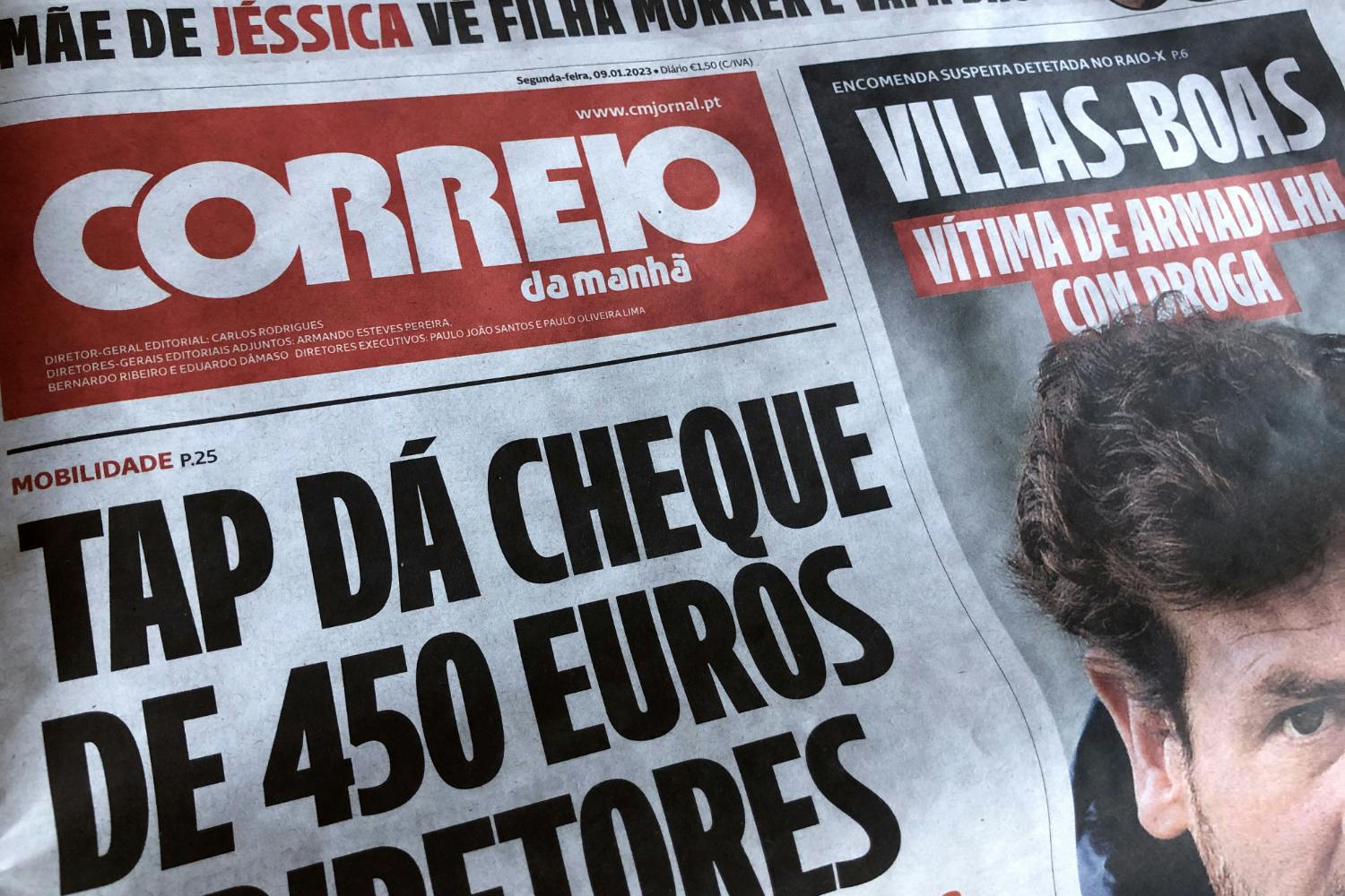
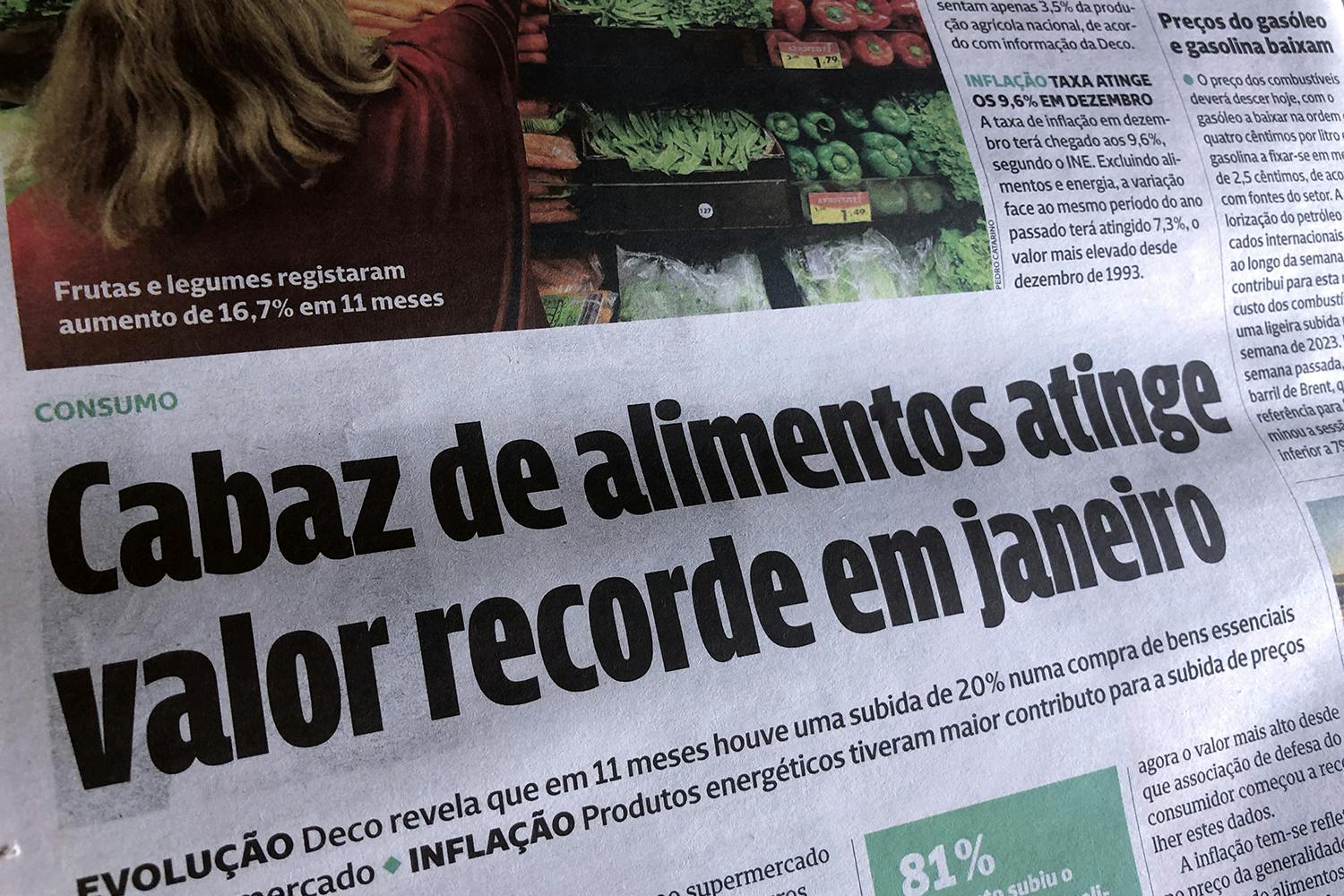
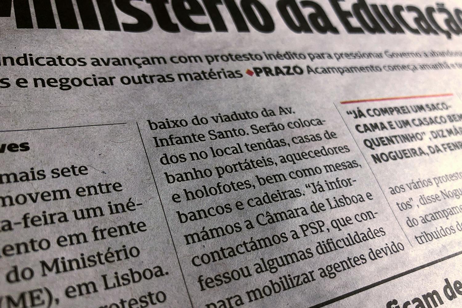
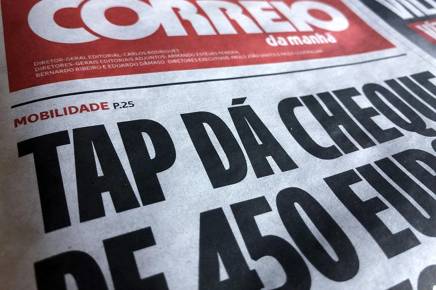
In 2021 we were invited to design the typefaces for the Correio da Manhã newspaper. They were using several typefaces from diverse sources, and the look was a typographic miscellanea. Our idea was to unify the typographic image by designing a complete type system, that would provide improved legibility, due to openess of the characters, but also a fresh new look and feel of the newspaper, by introducing some personality into the lettershapes. To fullfill all the needs for the newspaper redesign, we conceived a Slab Serif font for the running text and a complementary Sans Serif and Symbols for navigation, highlights and tables. Because it's a tabloid, we also designed some extra Compact Sans Serif fonts, with a special focus on diacritic marks, that would allow to set text almost without any leading.
Correio da Manhã - Overview
Correio Slab
Correio Sans
Correio Compact
In Use


Fonts
Correio Slab
Correio Sans
Correio Compact
Styles
Thin, ExtraLight, Light, Book, Medium, Bold, ExtraBold & Heavy with matching italics.
Script
Latin Extended CE
Art Direction
Vasco Ferreira Design
Client
Grupo Cofina S.A.